Understand the build and runtime boundaries.
This is the multi-page printable view of this section. .
Authoring
Author, organize, and style content for an Oink documentation site.
- 1: Configuration
- 2: Adding content
- 3: Organize your content
- 4: Hugo authoring tips
- 5: Navigation and menus
- 6: Look and feel
- 7: Code blocks and Code Groups
- 8: Logos and images
- 9: Shortcodes
-
10: Content components
- 10.1: Badge
- 10.2: Kbd
- 10.3: Fields and Field
- 10.4: FileTree
- 10.5: Image Zoom
- 10.6: Gallery
- 11: Diagrams and formulae
- 12: Taxonomy support
Start with site-wide configuration, then shape the content tree, writing conventions, navigation, visual language, media, shortcodes, and reusable components. These pages focus on authoring choices that remain under the consuming site’s control.
1 - Configuration
Configure Oink with Hugo settings and focused theme parameters.
OINK follows a “native first” configuration model. Site identity, languages, menus, outputs, taxonomies, markup, and modules stay in their Hugo-defined locations. Existing Docsy parameters remain where their semantics are useful. OINK adds only focused choices for behavior that cannot be inferred.
Configuration rules
- Prefer Hugo configuration over a theme-specific duplicate.
- Prefer an established Docsy parameter over an OINK synonym.
- Put brand, content, repository, and UI choices in their semantic locations.
- Keep internal vendor paths and template composition out of the public API.
- Fail early for invalid values or a missing required endpoint.
There is no oink.enabled flag and no params.oink.* tree. Adding either would
create a second theme mode and make every fix, test, and document ambiguous.
A complete baseline
This example makes English primary and Simplified Chinese secondary:
YAML
The module version is pinned in the site’s go.mod. A conventional theme
checkout can instead use theme: oink with the repository under themes/oink/.
Languages
defaultContentLanguage determines the unprefixed primary site. Language
weight controls the visible order. label is the language’s self-name, and
locale supplies the full HTML and SEO locale. Add languageDirection: rtl to
an RTL language.
File naming
For the colocated model used by this site:
TEXT
Files with the same base name are translations. Keep their logical page identity aligned. OINK reads Hugo’s translation relationships; it does not guess from arbitrary URL patterns.
Selector states
The selector needs no mode parameter. It is hidden for one configured language. With two or more, clicking the language icon advances to the next language by weight; hovering for half a second or focusing it opens the complete menu.
If the current page lacks a target translation, the target-language home page is used. Do not add dead page-shaped URLs merely to keep the selector on the same path.
Brand and repository
Set the site and per-language title and description. params.logo can point
to a Hugo Asset or a path under static/. Keep favicons and social images in
the documented asset locations.
Repository metadata drives “edit this page,” issue, and last-modified links:
YAML
github_project_repo defaults to github_repo where supported. github_subdir
is the content site’s path inside a monorepo. Keep github_branch resolvable; a
display version is not necessarily a Git ref.
Use params.wordmark for a horizontal brand asset that should appear in the
landing navigation, documentation header, mobile drawer, and footer. It accepts
the same asset and static/ paths as params.logo. If wordmark is absent,
OINK keeps the existing logo-and-title treatment:
YAML
Navigation and layout
OINK retains Docsy menus and UI parameters and adds focused shell controls:
YAML
page_width accepts normal, wide, or full and can be overridden in page
front matter. Sidebar minimum and maximum values are pixels used to clamp the
desktop drag resizer. sidebar_item_overflow: wrap wraps long labels; other
values retain the compact ellipsis behavior.
quick_links names top-level page references shown by the shell. Define their
translated names in each language’s main menu.
The page context menu keeps Open in ChatGPT / Claude, Copy as Markdown, View
Markdown, edit, issue, and print actions reachable at every viewport width. The
built-in assistant links appear on documentation pages and send the current URL
inside a localized prompt only when a reader activates one; they do not upload
the page body. links is empty by default. Additional custom links accept
URL-encoded {url}, {title}, and {markdown_url} placeholders:
YAML
Homepage and footer
Homepage content lives in data/home/<language>.yaml, with English used as the
fallback. Each language file contains named data blocks and an optional
sections list that composes those blocks into the exact landing-page order.
The footer uses the same file but is rendered independently of sections.
Compose sections
A string entry uses the same value as its section type and data key. A map entry
can select a built-in type, read a differently named key, set a stable id,
or temporarily set enabled: false:
YAML
Map entries may also carry their content in data, which is useful for a short
one-off block. Reuse a built-in type with different keys when two sections need
the same presentation. A site-owned layout can name an explicit partial, but
that is a custom template contract rather than portable homepage data.
If sections is absent, OINK preserves the 0.1.x order by rendering the blocks
that exist among hero, metrics, capabilities, principles, and cta.
Adding sections opts into explicit composition; omitted blocks then stay out
of the page even if their data remains in the file.
Built-in sections
OINK 0.2.0 provides 12 section types:
| Type | Use it for |
|---|---|
hero |
Primary message, actions, and theme-aware artwork |
metrics |
Compact facts, numbers, links, and supporting text |
capabilities |
Alternating feature narratives and specialist visual panels |
principles |
Numbered product or operating principles |
cards |
Generic feature, benefit, service, or path collections |
logo_wall |
Tools, integrations, partners, or project lineage |
gallery |
Screenshots or icon-led examples with badges and actions |
testimonials |
Quotations with optional attribution and source links |
contributors |
People, roles, avatars, and profile links |
faq |
Native disclosure controls with Markdown answers |
markdown |
Free-form prose when no collection layout is appropriate |
cta |
One final action or a compact group of actions |
Common collection blocks accept eyebrow, title, desc or text, columns,
and items. Item fields vary by presentation but consistently use title or
name, desc or text, icon, image, url, and external. Ordinary text
fields render Markdown. Keep internal URLs relative to the language root; set
external: true for links that should open as external navigation.
Hero media and brand footer
Every block is optional, so a site can keep a short landing page without copying the layout. For example:
YAML
The optional hero.image block adds a theme-aware visual on the right. Set
light and dark to files under the site’s static/ directory; the active
image follows the color-theme selector. If only src, light, or dark is
provided, OINK uses that image for both themes. A string value is also accepted
as a shared image. Omit image to keep the text-only Hero.
The homepage renders the large brand-and-navigation footer above the common
footline. The footline uses params.copyright on the left, optional
params.footer_icp and params.footer_icp_url in the center, and every
configured language on the right. Markdown in the copyright author and footer
brand text is rendered as links and inline markup.
Linked capability boards
A capability row can turn its component board into a compact navigator. Add a
url to each linked item, name the region with aria_label, and choose one to
four columns. Items without a URL remain decorative, so existing boards keep
their current behavior:
YAML
Search
The project site enables local search by default:
YAML
offlineSearchIndex controls how much text is downloadable in each language’s
index. The scopes are cumulative: title indexes titles and taxonomy metadata;
heading adds page headings; summary adds descriptions or summaries; and
content also adds the complete body. content is the compatibility default,
while summary is a smaller starting point for most documentation sites.
offlineSearchMaxResults applies to both Lunr and the CJK substring fallback.
Each language receives a distinct index. Hosted alternatives remain supported through their established Docsy settings, but enabling them intentionally adds an external service boundary. Do not configure several competing search providers without also deciding which UI should be visible.
Content runtimes
Browser-only runtimes
Mermaid and KaTeX are detected from content. Enable Markmap at the site level:
YAML
Swagger UI, Redoc, Asciinema, ECharts, Infographic, and carousel assets load when their shortcodes appear. Their local runtime paths are internal and should not be configured.
Service endpoints
PlantUML and Diagrams.net require explicit endpoints:
YAML
Leave the features disabled in an air-gap site unless those URLs are reachable inside the isolated network.
Page-level overrides
Hugo’s .Param lookup allows many site parameters to be overridden in front
matter:
YAML
Use overrides for real content differences, not to reconstruct a separate visual system page by page.
Avoid false configuration
Do not expose:
- a switch between “Docsy” and “OINK” shells;
- paths to vendored JavaScript, CSS, fonts, or internal partials;
- duplicated language or repository values under a brand namespace;
- toggles that merely select one of two copied implementations.
If a site needs a custom product matrix or portal, keep that component in the site and use a narrow hook or shortcode. A local business feature is clearer than a misleading global theme option.
Validate changes
After changing configuration:
- build with the minimum supported Hugo Extended version and the current validation version;
- test every configured language and one page without a translation;
- verify root and subpath
baseURLoutput if both are supported; - inspect local search and optional runtime requests;
- check the desktop and mobile shell, dark and light themes, and print output.
An accepted configuration is one that builds and behaves correctly, not merely one that parses as YAML.
2 - Adding content
Structure and author bilingual documentation and blog content.
OINK uses Hugo’s content model: Markdown carries the information, front matter carries page metadata, and layouts turn both into a static site. This guide describes the conventions used by the bundled English and Simplified Chinese sample site.
Content root directory
Site content lives below content/. A multilingual site can use separate roots
such as content/en/ and content/zh/, or translated filename suffixes in one
mounted tree. This repository uses the second form:
TEXT
The English file is the source page and the .zh.md file is its Simplified
Chinese translation. Both files share the same logical path after Hugo applies
the language suffix.
Keep generated files and files that must be copied byte-for-byte outside the
content tree. Put those in static/ as described in
Adding static content.
Content sections and templates
Every top-level content directory is a Hugo section. OINK includes layouts for:
docs: documentation with a section tree, table of contents, breadcrumbs, previous/next navigation, and repository links;blog: dated articles, taxonomy metadata, feeds, and chronological lists;community: project and contributor links;- default pages: landing pages without the documentation sidebar.
Hugo chooses a layout from the content section. A page below content/docs/
therefore uses the docs layout. Set type in front matter only when a page
must use another section’s layout.
Custom sections
Create a directory below the content root, then give its pages a type when the default layout is not sufficient:
YAML
For section-wide behavior, put shared values in the section’s _index.md
cascade rather than repeating them on every page. Add a project layout under
layouts/ only when no existing OINK layout or partial is suitable.
Doc-rooted sites
EXPERIMENTAL
A documentation-first site can publish the docs section at the URL root while
keeping source files under content/.../docs/:
YAML
The docs section landing page then becomes the home page. Add this front matter to the physical site-root index for each language so it can still act as a link without competing for the same output path:
YAML
Check for path conflicts
Docs now share the URL root with blog, community, and other sections. Build with
--printPathWarnings and resolve every duplicate target before publishing:
BASH
Legacy docs-only setup
Older Docsy examples used a front matter cascade to force page types. Remove that workaround when moving to the permalink-based doc-rooted setup; otherwise the home page and section layouts can resolve inconsistently.
Page front matter
Front matter is page metadata written in YAML, TOML, or JSON. OINK’s sample site uses YAML:
YAML
title is the practical minimum. In maintained documentation, also provide a
concise description for search and metadata, and a weight when order
matters. Use linkTitle only when navigation needs a shorter label.
Translations should localize human-facing metadata while preserving structural values:
YAML
Do not translate keys, shortcode names, configuration keys, file paths, or stable identifiers.
Footer metadata
Docs and blog pages render a compact metadata block above the site footer. The
last-modified date comes from Hugo’s .Lastmod value. Two optional front matter
fields add provenance notices:
YAML
upstream_attribution links to the upstream source and its attribution.
downstream_modified: true states that the downstream project changed the page.
Omit either field when its notice does not apply.
Page content
Write pages in Markdown unless a layout genuinely requires HTML. Hugo renders Markdown with Goldmark and supports attributes, footnotes, tables, task lists, render hooks, and fenced code blocks.
Markdown
Keep source readable without the rendered site:
- use ATX headings (
## Heading); - put blank lines around lists, blocks, and fenced code;
- specify the language of every code fence when one exists;
- use descriptive link text and image alternative text;
- wrap prose at a review-friendly width, but never reflow code or URLs.
OINK adds render hooks for blockquote alerts and for Mermaid, math, chemistry, Markmap, and PlantUML code blocks. See Diagrams and Formulae.
Markup, shortcodes, and content features
Use standard Markdown for ordinary prose. Use a shortcode when it supplies meaningful behavior such as tabs, cards, a terminal recording, an API viewer, or a safe chart. Shortcodes are part of the content contract: verify their arguments in both languages and avoid copying rendered HTML into translations.
Alerts
OINK supports GitHub-style blockquote alerts and optional Obsidian-style titles:
MARKDOWN
Supported semantic types include NOTE, TIP, IMPORTANT, WARNING, and
CAUTION, plus the Bootstrap-compatible types and NB. Use alerts sparingly:
important instructions must still make sense to screen readers and in print. See
Alerts for appearance.
Links
Use root-relative links for stable public routes and ordinary relative links for
nearby pages or bundle resources. Hugo’s ref and relref shortcodes validate
content references and account for language and permalink rules:
MARKDOWN
For bilingual pages:
- link to the logical page, not directly to a
.zh.mdfilename; - keep fragment IDs language-neutral;
- verify that both language variants resolve the same fragment;
- use
relrefwhen the destination must remain relative to the current host.
Run the internal-link check after changing routes or headings.
Content style
Write task-oriented documentation in direct language. Introduce a concept before
its configuration, state defaults explicitly, and distinguish local build
verification from deployment or publication. The Chinese edition follows the
terminology and typography rules in oink.pgsty.com/TRANSLATION.md.
Page bundles
A standalone page is a single Markdown file. A leaf bundle is a directory with
an index.md and page resources:
TEXT
Both language pages can use the same image and downloadable file. Hugo normally shares page resources across language variants on a single host, so do not duplicate identical binary assets. Localize an image only when it contains meaningful text; give the localized resource a clear language suffix.
Use branch bundles (_index.md) for sections that contain child pages and leaf
bundles (index.md) for terminal pages with resources.
Adding docs, blog posts, and release notes
Create every maintained English page and its Chinese peer in the same directory:
TEXT
For bundle pages, pair index.md with index.zh.md. Keep routing metadata,
dates, weights, aliases, and resource declarations aligned unless a
language-specific difference is intentional.
Organizing your documentation
Use directories to reflect the reader’s information architecture, not the
implementation’s package tree. Each documentation subsection needs an
_index.md and an _index.zh.md. Child pages appear in the sidebar ordered by
weight, then by the configured fallback ordering.
Prefer a shallow hierarchy. Split a page when it serves a distinct task or audience; do not split merely to shorten a file. See Organizing Your Content.
Docs section landing pages
A docs _index.md renders child-page summaries by default. Use:
YAML
to render a compact list, or:
YAML
to suppress the generated list. Give each language variant a localized title and description, and keep the structural option identical.
Organizing blog posts and release notes
Separate posts by publisher and audience. Keep every upstream Docsy article,
including Docsy release reports, flat under blog/docsy/. Keep OINK-specific
articles flat under blog/oink/, and reserve blog/release/ for versioned OINK
release notes. Do not add year subdirectories; pair each article in place:
TEXT
A Docsy release note normally supplies a publisher-qualified linkTitle:
YAML
Prefix link titles for other Docsy articles with Docsy as well, so mixed
sidebar and list views make ownership clear.
Keep the publication date and author identity consistent across translations. Translate the title, description, taxonomy labels, caption text, and body. Do not translate commit IDs, release tags, commands, or URLs.
Working with top-level landing pages
Default-layout pages are suitable for the home page, product overview, and other destinations that do not need the docs sidebar.
Customizing the example site pages
The bundled home page is content/_index.md with content/_index.zh.md as its
translation. It uses the same local assets and theme pipeline as the rest of
OINK. Change content and project assets in the site; do not edit vendored
runtime files merely to alter branding.
Building your own landing pages
Compose landing pages from standard Markdown and
blocks/* shortcodes. Keep essential
information in text, make call-to-action links meaningful, and test the page at
mobile and desktop widths in both languages.
Adding a community page
Create community/_index.md and community/_index.zh.md. The community layout
uses params.links.user and params.links.developer:
YAML
Entries may set rel; OINK also adds noopener to external HTTP links where
appropriate. Set params.contributingUrl in the community page front matter if
the contribution guide is not at the conventional docs route.
Adding static content
Files below static/ are copied to the published root without Markdown
rendering or fingerprinting:
TEXT
is published as /reference/api/index.html. Use this for externally generated
reference sites, verification files, and downloads that require stable names.
Prefer page resources or Hugo Pipes for assets that need resizing,
fingerprinting, or bundle-relative lookup.
OINK’s browser runtime is intentionally shipped from the theme or site itself.
When adding a library, vendor and pin it, record it in VENDOR.json, and do not
introduce an implicit CDN fallback.
RSS feeds
Hugo creates feeds for the home page and list sections. Disable them globally only when the site has no feed consumers:
YAML
If a section declares custom outputs, retain RSS explicitly:
YAML
Check the generated language-specific feed URLs and ensure titles, summaries,
dates, canonical URLs, and hreflang relationships are correct.
Sitemap
Hugo generates sitemap.xml by default. Site-wide settings are:
YAML
A page can override these values:
YAML
Treat changefreq and priority as hints, not promises. Exclude drafts,
private material, and noncanonical duplicates before deployment, then inspect
the generated sitemap for every published language.
3 - Organize your content
Structure documentation around reader goals and content types.
Oink derives the documentation sidebar from Hugo’s content tree. The directory structure is therefore part of the reader experience, not just a source-code detail. Start with the questions readers need answered, then create the smallest hierarchy that makes those answers easy to find.
Start from reader goals
Give new readers a short path from product context to a successful first task. Give returning readers direct routes to procedures, reference material, and troubleshooting. A practical documentation set usually needs:
- an overview that establishes scope and product boundaries;
- a get-started path that produces a working result;
- task-oriented guides for common jobs;
- reference pages for parameters, APIs, and compatibility;
- troubleshooting for predictable failure modes.
Examples are useful when readers can copy or compare them, but they should not replace the procedure or reference that explains the behavior.
Use predictable content types
Keep pages focused on one reader intent:
| Content type | Reader question |
|---|---|
| Overview | What is this, and when should I use it? |
| Tutorial | How do I reach a first working result? |
| How-to guide | How do I complete one specific task? |
| Reference | What fields, commands, or interfaces exist? |
| Explanation | Why does the system behave this way? |
| Troubleshooting | How do I diagnose and recover from a failure? |
Do not create an empty top-level section merely to mirror an organization chart. Add a section when several pages share a stable reader purpose.
Keep the hierarchy shallow
Prefer a short, explicit route over a deep classification tree. Use page weights to establish a learning sequence, and keep related page weights spaced consistently so new pages can be inserted without renumbering the entire section. Add an icon and concise description to every navigable page so the sidebar and section indexes remain scannable.
See Adding content for Hugo’s bundle and section model, and Navigation and menus for sidebar behavior.
Plan languages together
Create the English source and Simplified Chinese peer in the same directory. Keep page order, intent, examples, and stable heading IDs aligned. If the two languages need different prose lengths, preserve the same information rather than forcing sentence-for-sentence symmetry.
Review the complete route
After moving or adding pages, review the documentation landing page, section index, sidebar, breadcrumbs, previous/next navigation, local search, and every homepage link. Build both languages and validate rendered fragment links before publishing.
4 - Hugo authoring tips
Avoid common pitfalls when writing content for an Oink site.
Oink is a Hugo theme, so ordinary Markdown and Hugo’s content model remain the authoring foundation. These conventions keep pages readable in source form and stable after translation, reorganization, or subpath deployment.
Link to published routes
Link readers to the canonical published URL, not to a neighboring source-file
path. Root-relative links such as /docs/content/ are easy to audit across the
site. When a link should follow a page through source moves, Hugo’s ref and
relref shortcodes can resolve the target page:
MARKDOWN
After moving a page, add an alias for the old public route and update every internal link to the new canonical route. Do not rely on the alias as the site’s permanent navigation path. See Adding content for link and image behavior.
Keep front matter useful
Every navigable page needs a clear title, concise description, intentional
weight, and suitable Font Awesome icon. Keep descriptions to one sentence
that fits on one line in a normal desktop content card. Add linkTitle only
when the navigation label genuinely needs to differ from the page title.
English is the primary source language. Add the Simplified Chinese peer beside
it as .zh.md, and translate reader-facing metadata as carefully as the body.
Preserve stable headings
Use explicit heading IDs when pages are translated or widely linked:
MARKDOWN
Copy the same ID to the corresponding Chinese heading. When renaming a heading, preserve an established ID unless its meaning also changes.
Write procedures as tasks
State prerequisites before commands, use imperative steps, and show the expected result or verification command. Separate local preview, production build, hosted deployment, and public release evidence; success at one layer does not establish the next.
Make code examples actionable
Name a block when it represents a real file, use console for a transcript with
prompts and output, and collapse long reference listings that readers do not
need to scan before continuing. Use a Code Group only when panels are
interchangeable ways to complete the same task.
hugo.yaml
YAML
Metadata should clarify an example, not decorate every fence. See Code blocks and Code Groups for filenames, Copy policies, wrapping, collapse, line links, and synchronized alternatives.
Review rendered states
Build both languages and inspect representative pages on desktop and mobile, in light and dark modes. Verify headings, fragments, code, tables, alerts, navigation, search, print output, and page descriptions in the rendered site.
5 - Navigation and menus
Configure navigation, language switching, sidebars, and outlines.
OINK combines Hugo’s content tree and menu model with a documentation workspace: a global navbar, a collapsible and resizable section sidebar, and a collapsible page outline. The same structure works for English, Chinese, and right-to-left languages.
Site navbar
The global navbar is built from Hugo’s main menu plus OINK-generated controls.
Depending on configuration and page type, it can include version, language,
color-mode, and search controls.
Adding main menu entries
Define a menu entry in page front matter:
YAML
Lower weights appear first. A site-level external link is similar:
YAML
Use an identifier for configuration that refers to a menu item. Localize
name or linkTitle in language configuration, but keep identifiers stable.
Version menu
The selector appears when params.versions is configured. Each entry can be a
heading, separator, release, development build, or site variant:
YAML
version identifies the published site variant and is not necessarily a Git
ref. Commands that require a resolvable tag should use the project’s explicit
release-ref parameter instead. With page links enabled, OINK first tries the
equivalent path on the target version and otherwise uses its configured URL.
Language menu
OINK builds language targets from Hugo’s AllTranslations. When a translated
peer is missing, the target language’s home page is used instead of a broken
URL. One configured language hides the control. With two or more languages, a
click advances to the next language by weight, while hovering for half a second
or focusing the control opens the complete menu. The current site cycles from
English to Simplified Chinese and back. Targets include lang, hreflang,
locale, and text-direction attributes.
Light/dark theme menu
When color-mode support is enabled, the navbar and documentation workspace show a theme control. See Light/dark-mode menu.
Search box
The documentation workspace uses a local search dialog when offline search is enabled. The sidebar button advertises the platform shortcut (Command/Ctrl+K). Online search integrations remain available by explicit configuration. See Search.
Adding icons to the navbar
Use pre or post on a menu entry. OINK includes the free local Font Awesome
assets:
YAML
Decorative icons need aria-hidden="true"; the link itself must retain a useful
text or accessible label. External links that open a new tab must use
rel="noopener".
Side navigation
The left panel on docs and blog pages is generated from the content hierarchy.
OINK orders entries by weight and uses linkTitle when present. Sections come
from _index.md files; translated sections need a peer _index.zh.md so their
navigation metadata is localized.
Hide a page from the sidebar with:
YAML
Hide it from a section landing-page summary with hide_summary: true. Set both
only when the page should be absent from both discovery surfaces.
Side-nav options
The common controls are:
YAML
sidebar_menu_compactshows the active branch and nearby entries.sidebar_menu_foldablelets readers expand or collapse sections.sidebar_menu_truncatelimits entries and emits a build warning when the limit is too small.sidebar_cache_limitenables shared navigation markup above the configured site size.sidebar_width_minandsidebar_width_maxclamp the desktop drag-resizer.sidebar_item_overflowisellipsisby default; usewrapfor long labels.
The reader’s collapse state, width, and scroll position are preserved locally. The mobile view becomes a dismissible drawer with a backdrop and focus-safe controls.
Adding icons to the side nav
Set icon in page front matter:
YAML
Use icons consistently across siblings. They are secondary cues, not a replacement for text labels.
Adding manual links to the side nav
Create a placeholder page at the desired position:
YAML
Use manualLinkRelref instead of manualLink for an internal content
reference; Hugo then fails the build if it cannot resolve the destination. OINK
adds noopener for new-tab links. Include a short body explaining the
destination because Hugo still generates a page for the placeholder.
Section as sidebar root (EXPERIMENTAL)
Enable rooted sidebars:
YAML
Then set a section’s _index.md:
YAML
self applies the root to the section index and descendants; children keeps
the index in the parent tree but roots its descendants. The optional root menu
lets readers switch between roots. Rooted sections can nest, but redundant or
invalid values produce build warnings.
Table of contents (TOC)
Hugo builds the right-side page outline from Markdown headings. OINK renders it as a fixed documentation panel with quick links, language and theme controls, repository metadata, and taxonomy terms. Readers can collapse the panel; its state is stored locally.
Headings emitted by Markdown shortcodes ({{%/* ... */%}}) participate in
Hugo’s table of contents. Headings emitted only by standard shortcodes
({{</* ... */>}}) generally do not, so content structure should remain in
Markdown whenever possible.
TOC customization
Hide the outline on one page:
YAML
Configure which heading levels Hugo includes:
YAML
Localize labels such as toc_on_this_page in the site’s i18n bundle. If custom
CSS changes the outline rail or fixed-panel dimensions, test active tracking,
zoom, keyboard focus, and pages with no headings.
Active TOC entry tracking with ScrollSpy
OINK uses a local Bootstrap ScrollSpy patch and IntersectionObserver to track the active heading. The workspace draws a continuous rail, active segment, and position marker. Disable tracking for a page with:
YAML
The legacy ScrollSpy configuration also accepts a global rootMargin. Changing
it affects when an entry becomes active and should be tested with short
sections, long sections, and direct fragment navigation.
Advanced ScrollSpy customization
Prefer configuration and project CSS. Overriding the ScrollSpy attribute partial
or docs-shell.js creates an implementation-level fork; add browser fixtures
for hash updates, back/forward navigation, resizing, reduced motion, and pages
that contain duplicate or missing IDs.
Breadcrumb navigation
Breadcrumbs are shown above ordinary content pages and in taxonomy results. Disable them globally:
YAML
The same ui.breadcrumb_disable value can be set in a page or section cascade.
Breadcrumb labels come from localized page titles and must follow the same
logical hierarchy as the sidebar.
Heading self links
Enable OINK’s heading render hook in a consuming site:
GO-HTML-TEMPLATE
The generated .td-heading-self-link control uses # by default. It remains
visible on touch devices and appears on hover or focus for pointer devices. Keep
the link keyboard reachable and preserve a scroll offset that clears fixed
navigation.
Heading aliases and in-page targets
Changing a heading can break inbound fragment links. Treat its ID as a public route. To rename an ID, retain the old one as an empty anchor and set the new one explicitly:
HTML
Use an empty <a id="..."></a> for an alias or other in-page target. Do not use
a span solely as a fragment target. IDs must be unique, stable, ASCII where
practical, and identical across language variants.
Quickstart
This live heading demonstrates that both #get-started and #quickstart reach
the same location. Translated headings should write the English rendered ID
explicitly rather than relying on language-specific automatic slug generation.
Implementation notes
- The document sets a global scroll offset for fixed chrome.
- Built-in block targets use
td-anchor-no-extra-offsetto avoid applying the additional offset twice. - The translation audit compares rendered heading IDs between English and Chinese pages.
- Removing an old alias is a breaking documentation change and needs a redirect or an explicitly documented compatibility decision.
6 - Look and feel
Customize themes, typography, code styles, and page layouts.
OINK ships a complete visual system built on Bootstrap and Docsy, with local fonts, icons, styles, and browser code. A consuming site can change tokens and project styles without rebuilding a Node dependency tree.
Project styles
Hugo Extended compiles the theme’s SCSS through Hugo Pipes. Project overrides participate in the same bundle, so production builds can minify, fingerprint, and integrity-check one same-origin stylesheet.
Project style files
Override these files in the site’s assets/scss/ directory:
| File | Purpose |
|---|---|
_variables_project.scss |
Variables set before Bootstrap and OINK defaults |
_variables_project_after_bs.scss |
Variables or maps that require Bootstrap definitions |
_styles_project.scss |
Project selectors loaded after the theme’s component styles |
Start with the smallest override:
SCSS
SCSS
Do not edit vendored Bootstrap, Font Awesome, or local font files for ordinary branding. A theme update would overwrite those changes and obscure the dependency boundary.
Advanced style customization
For the stable customization layers, typography presets, semantic font roles, and content-scoped patterns, read Advanced customization.
OINK’s SCSS import order is:
- Bootstrap functions;
- project variables;
- OINK defaults and Bootstrap;
- post-Bootstrap project variables;
- OINK components and local brand layer;
- project styles.
Use variables or CSS custom properties for stable design decisions. Override a selector only when no token exists, and scope it to the smallest component. Inspect both light and dark output because many colors are theme-dependent.
⚠️ Resetting internal styles
OINK’s internal partials are not a public Sass API. Importing or suppressing individual internal files couples a site to repository layout and import order. If a product needs a fundamentally different shell, override a Hugo layout or maintain a deliberate theme fork instead of resetting the entire stylesheet.
Extra styles
For isolated third-party CSS, publish a local asset from a hook:
GO-HTML-TEMPLATE
Put the template in layouts/partials/hooks/head-end.html. Prefer the project
SCSS files when the rules belong to the site’s design system. Never use a remote
stylesheet as an implicit fallback.
Colors and color themes
Bootstrap semantic colors and OINK brand tokens are available throughout the theme. Semantic names communicate intent better than literal colors.
Site colors
Set Bootstrap variables before compilation:
SCSS
OINK’s canonical layer also exposes CSS properties such as --td-brand-elev,
--td-brand-silk, --td-brand-copper, --td-brand-header-bg, and
--td-brand-mark-gradient. Override them on :root and
[data-bs-theme='dark'] as a pair:
SCSS
Light/dark color theme and mode support
Color theme is the palette used by a component; color mode is the
site-wide light or dark state. OINK uses Bootstrap’s
data-bs-theme="light|dark" attribute and stores an explicit reader choice in
local browser storage. With no choice, it follows prefers-color-scheme.
Every custom component must define legible states for both modes, including hover, focus, disabled, selected, and code colors. Do not encode meaning by color alone.
Light/dark color modes
The default sample site enables color-mode support and shows the selector:
YAML
The selector updates the document before normal interaction to limit a flash of the wrong theme. OINK’s script is local and does not contact an external service.
Choosing themes or color modes for your site
Use the default automatic behavior for most sites. Choose a forced mode only when the complete visual identity has been tested in that mode and readers do not need an alternative. Screenshots are not sufficient: check real text, tables, alerts, forms, diagrams, code, and focus indicators.
How to disable dark mode
To disable dark mode and hide the menu:
YAML
The experimental value enable-only (experimental) enables theme-aware styles
without showing a selector. Treat it as transitional because the configuration
surface can change.
How to pick colors with good color-contrast
Meet WCAG contrast requirements in every component state. Test actual computed colors, including translucent layers over images. As a working minimum, normal text needs 4.5:1 contrast and large text needs 3:1; focus and non-text UI indicators also need adequate contrast. Automated tools catch common failures, but keyboard and visual review remain necessary.
Fonts
OINK does not fetch Google Fonts. Open Sans, Chakra Petch, IBM Plex Mono, and
Font Awesome files used by the theme are stored locally. The legacy Sass
variable $td-enable-google-fonts controls the bundled Open Sans faces despite
its historical name.
Set typography in _variables_project.scss:
SCSS
OINK also exposes build-time typography presets and runtime-independent semantic font roles. See Advanced customization for the complete public interface and examples that scope a font to blog, OpenAPI, or code-heavy pages.
If you add a font, subset and self-host it, include the required scripts, use
font-display: swap, document its license in VENDOR.json, and test CJK
fallback. Do not make page rendering depend on a font CDN.
CSS utilities
Bootstrap utility classes are available in Markdown with raw HTML and in
layouts. Prefer semantic Markdown and OINK shortcodes for content; use utilities
for small, presentational adjustments that remain understandable at different
breakpoints. Project-wide patterns belong in _styles_project.scss.
Code blocks
OINK supports Hugo Chroma by default and a locally vendored Prism option. Choose one highlighter consistently; enabling both produces duplicate markup or styles. For filenames, Copy policies, wrapping, collapse, line anchors, and shareable Code Groups, see Code blocks and Code Groups.
Code highlighting with Chroma
Chroma runs during the Hugo build and requires no browser highlighter. Use a language identifier:
MARKDOWN
Basic Chroma style configuration
Configure markup in Hugo:
YAML
OINK expects class-based output so light and dark styles can differ. When regenerating a palette, keep the generated CSS local and review it against the brand background.
Light/dark code styles and more
The theme includes separate Chroma palettes under assets/scss/td/chroma/ and
applies them by mode. Project overrides should target .chroma beneath the
relevant theme attribute, not hard-code a global background.
Selecting console block content
Use console for terminal transcripts. OINK styles prompts and output for
selection so readers can copy commands without decorative prompt text. Keep
commands and their output on distinct lines, and never rely on color alone to
distinguish them.
Code blocks without a specified language
An unlabelled fence renders as plain code. Use it only when no grammar applies,
and label command sessions as console or bash instead of asking Chroma to
guess.
Copy to clipboard
Copy buttons are enabled for Chroma unless params.disable_click2copy_chroma is
true. Clipboard access requires a secure context in deployed browsers. The
control must remain keyboard accessible and must not copy line numbers or
prompts.
Code highlighting with Prism
Set:
YAML
to use OINK’s local prism.js and prism.css. This is a compatibility option
for existing sites; Chroma is preferred for a browser-light build.
Code blocks with no language
Prism also treats unlabelled blocks as plain text. Add the correct language class rather than enabling heuristic detection.
Extending Prism for additional languages or plugins
Build and vendor the exact Prism bundle, replace the local files in a controlled theme change, record its version and license, and add a fixture that exercises the language or plugin. Do not pull Prism components from a CDN at runtime.
Navbar
OINK’s navbar contains the project identity, main menu, version and language selectors when applicable, color-mode control, and search. On small screens, overflowing primary items remain horizontally reachable.
Default look and feel
The navbar uses the local brand palette and a fixed minimum height.
On mobile
The brand and actions stay visible while the primary menu can scroll. Test long Chinese labels, 200% zoom, touch targets, focus order, and both page directions.
On desktop
The main menu expands inline; version, language, mode, and search controls stay grouped. Avoid enough custom entries to push controls outside the viewport.
Translucent over cover images
The blocks/cover shortcode marks the navbar as cover-aware. It starts
translucent and gains the normal background as the page scrolls.
Customizing the navbar
Use configuration for behavior and project SCSS for presentation. Preserve the landmark, focus order, accessible labels, and responsive overflow behavior when overriding the navbar partial.
Navbar height
Override $td-navbar-min-height before theme styles compile. Re-test anchor
offsets, sidebar height, mobile wrapping, and cover blocks because all depend on
this value.
Background color/opacity
Set --td-navbar-bg-color or --td-brand-header-bg in both modes. If the
background is translucent, validate contrast over every cover image and provide
a solid scrolled state.
Setting the navbar light/dark color theme
A page can set ui.navbar_theme: dark in front matter or cascade when its cover
requires light foreground controls. This changes navbar component styling; it
does not force the whole site’s color mode.
Translucent over cover images
Disable translucency site-wide with:
YAML
Prefer this when cover imagery is unpredictable or accessibility review cannot guarantee contrast.
Styling your project logo and name
Place logo partial overrides under layouts/partials/ and source assets under
assets/ or static/. Provide meaningful alternative text for informative
marks and an empty alternative for a purely decorative mark. SVGs must use a
view box and inherit or define colors for both modes.
The OINK sample uses a text wordmark with a local gradient. Change the site title in language configuration and the visual tokens in project SCSS; do not replace brand text with an image when selectable text works.
Light/dark-mode menu
The selector appears when params.ui.showLightDarkModeMenu is true. Keep it in
the shared navigation so its state applies consistently across languages and
page types.
Alerts
Markdown alert types map to semantic OINK/Bootstrap styles. Customize .alert-*
and the alert render hook only as a pair, retain a visible label or icon, and
test links and inline code inside every background. See
Adding Content for syntax.
Tables
Markdown tables receive responsive and theme-aware styles. Keep cells concise, use real header cells, add a caption in custom HTML when context requires one, and test horizontal overflow on mobile. A table should not be used to position unrelated content.
Customizing templates
Hugo resolves site layouts before theme layouts. Copy only the smallest partial
that needs changing and compare it during upstream syncs; a full baseof.html
override can silently miss future accessibility and asset-pipeline fixes.
Add code to head or before body end
Use layouts/partials/hooks/head-end.html for head additions and
layouts/partials/hooks/body-end.html for scripts or closing integrations.
Self-host assets, load them only on pages that need them, and keep production
CSP compatible.
Adding a banner before page content
Override the relevant hook or content partial with a condition based on page parameters. A banner must not hide the page heading, trap keyboard focus, or shift anchor targets beneath the fixed navigation.
Adding custom class to the body element
Set body_class in page front matter or a section cascade:
YAML
OINK appends the value to its generated body classes. Use a project-specific, semantic class name and never insert untrusted content into this field.
7 - Code blocks and Code Groups
Add filenames, exact Copy behavior, wrapping, collapse, and shareable groups to Hugo code examples.
OINK enhances Hugo’s ordinary fenced code blocks without replacing Chroma or requiring a browser highlighter. The server emits the complete code and shell; small page-scoped scripts only enable Copy, visual collapse, and tab state.
Enhanced fences
Add metadata in Hugo’s fence attribute list. A fence without attributes still
receives the same responsive shell and its normal Copy default. filename adds
a visible header; title is its compatible alias, and setting both is a build
error. With neither, OINK uses a compact overlay instead of an empty title row.
Authoring
content/docs/example.md
MARKDOWN
Live result
Rendered result
This block combines a filename, inline line numbers, a stable root ID, line
links, and highlighted source lines. Line numbers begin at 12, while hl_lines
still addresses the source lines inside the fence:
hugo.yaml
YAML
Shell parameters
| Attribute | Values | Behavior |
|---|---|---|
filename |
string | Visible filename and accessible group name |
title |
string | Alias for filename on an ordinary fence |
copy |
all, command, false, or true |
Copy policy; true is shorthand for all |
wrap |
true or false |
Visually wrap long lines without changing text |
collapse |
positive integer | Initial maximum number of visible source lines |
label |
string | Accessible label when no filename is suitable |
id |
string | Stable public block ID and line-anchor prefix |
Hugo generic class, safe data-*, aria-*, and global attributes remain on
the .td-code root. Names beginning with data-td-code and data-language are
reserved. OINK rejects event-handler and inline-style attributes. Use label to
override a filename-derived accessible name; a generic aria-label together
with label or filename is a build error.
Hugo options
The render hook continues to pass these options to Hugo:
lineNos,lineNoStart, andanchorLineNos;hl_lines;tabWidthandstyle.
Class-based Chroma markup remains inside .highlight and .chroma, so existing
token-level overrides keep working. The new stable outer element is .td-code;
sites using direct-child selectors such as .td-content > .highlight should
update those selectors.
The visible language label normalizes the common bash, sh, and shell lexer
aliases to BASH. The original lexer value is still passed to Chroma and
retained in data-language.
Diffs deliberately use Chroma’s standard diff lexer rather than a custom
transformer:
Authoring
content/docs/configuration.md
MARKDOWN
Rendered result
hugo.yaml.diff
DIFF
Copy semantics
Ordinary source defaults to copy="all". console and shell-session default
to copy="command": only lines carrying Chroma prompt tokens are copied, and
prompt/output tokens are excluded. Use copy="all" when a complete transcript
is intentional. command on another language is a build error.
Copy preserves indentation, internal blank lines, and Unicode, removes line
numbers, trims only trailing newline characters, and appends exactly one final
newline. A session lexer that emits no prompt token reports a localized failure
and copies nothing. Set params.disable_click2copy_chroma: true to hard-disable
Copy for the entire site.
Copy is shown as a compact icon without adjacent text. Its localized label is still exposed to assistive technology and as a hover tooltip; success and failure also change the icon and update the live status message.
For a multi-line terminal command, include the continuation prompt (normally
>) on every continued transcript line. Chroma classifies an unprompted line as
output, so copy="command" deliberately excludes it.
The Copy action on this live session copies the two commands, not the prompts or output:
Authoring
content/docs/terminal.md
MARKDOWN
Rendered result
Terminal session
CONSOLE
Wrapping and collapse
wrap=true changes presentation only; copied source is untouched. It is
incompatible with Chroma’s table line-number layout because separately wrapped
gutter and source cells would drift. Use inline line numbers or disable wrap.
OINK fails the build instead of silently misaligning them.
collapse=N is progressive enhancement. The server always emits all source; the
browser clips only after it can measure the Nth real Chroma line. Without
JavaScript, in assistive technology, and in print, the listing remains complete.
Reduced-motion preferences disable the height animation.
The first example wraps a long value without altering copied text:
Authoring
content/docs/downloads.md
MARKDOWN
Rendered result
config/artifacts.env
TEXT
The second emits all lines on the server but initially shows six in a browser:
Authoring
content/docs/configuration.md
MARKDOWN
Rendered result
hugo.yaml
YAML
Stable IDs and line links
Set a page-unique explicit id when publishing line-number links. IDs cannot
contain ASCII whitespace or control characters and cannot collide with another
code component’s generated viewport, tab, panel, title, or line-anchor ID. OINK
reports any such collision as a build error:
Authoring
content/docs/server.md
MARKDOWN
Rendered result
GO
OINK derives unique line-anchor prefixes from that ID. Generated IDs are safe inside a page but depend on the block ordinal and are not a permalink contract; inserting an earlier fence can change them.
Code Groups
Use code-group when examples are alternatives rather than independent tabs:
Authoring
content/docs/install.md
GO-HTML-TEMPLATE
Rendered result
npm BASH
pnpm BASH
yarn BASH
code-tab contains raw code, not Markdown. OINK removes the framing newline and
closing-shortcode indentation while preserving all source whitespace inside.
Because a Markdown formatter can otherwise reflow that raw body, put
<!-- prettier-ignore --> immediately before each live code-group when using
Prettier, as in the examples below.
Group and tab parameters
Every group requires a page-unique lower-case id. Optional sync, persist,
label, copy, wrap, and collapse values apply to the group; the last
three are inherited defaults. persist defaults to true.
Every child requires a plain-text title and stable lower-case value. lang
defaults to text; selected, copy, wrap, collapse, and the Hugo
highlight options can override group defaults. A group cannot be empty, repeat a
value, or contain more than one selected=true child. Filenames are omitted
inside groups because the tab itself identifies the example.
Selection, sync, and persistence
A selected panel has the public hash #<group-id>-<value>, for example
#install-client-pnpm. Initial selection priority is URL hash, saved value,
selected=true, then the first child.
Groups sharing sync select the same value when that value exists in each
group; a peer missing it stays unchanged. A user selection updates the hash with
replaceState and saves the value when persistence is enabled. Visiting a
shared hash activates the requested examples without overwriting the reader’s
saved preference. persist=false disables storage, not in-page synchronization.
Live synchronized groups
The rendered install group above and the run group below share the same sync
key. Choose a package manager in either group and the other follows. The first
group’s npm, pnpm, and
yarn panels also have shareable hashes.
Authoring
content/docs/run.md
GO-HTML-TEMPLATE
Rendered result
npm BASH
pnpm BASH
yarn BASH
Output and compatibility
Print hides controls and tab rows, expands every listing, and places each group title before its code. Markdown output turns every grouped or legacy tab into a readable titled fence and chooses a longer delimiter when source contains backticks. Feeds and other non-interactive outputs use stacked examples. Pages without applicable code or tabs do not load their runtimes.
Existing tabpane source and its td-tp-persist:* browser keys remain
compatible. Prism remains a legacy alternative and does not receive Enhanced
Code Blocks or Code Groups. Specialized mermaid, math, chem, markmap,
and plantuml hooks continue using their own renderers.
8 - Logos and images
Configure logos, page icons, favicons, and images.
Add brand marks
Oink uses assets/icons/logo.svg as its default brand mark. Override it with
params.logo, or set params.wordmark when the header should show a complete
wordmark instead of an icon followed by the site title:
YAML
Both parameters can name a Hugo asset or a public path. Prefer assets/ for
theme-processed files and static/ when a file must be copied unchanged. Keep
the source SVG tightly cropped so the header, sidebar, and footer can size it
consistently.
For brand typography, dimensions, and project SCSS, see Look and feel.
Use icons
Oink bundles Font Awesome Free and serves its fonts locally. Set a page’s icon
in front matter to give the page and its navigation entry a stable visual cue:
YAML
Use an icon available in the bundled free set. The exact vendored version is
recorded in the theme’s VENDOR.json. Menu-specific icon behavior is
covered in Navigation and menus.
Add favicons
Oink does not impose a product favicon. Instead, it discovers conventionally
named files in the consumer site’s static/ directory and adds the matching
<link> elements to every page.
| File | Generated link |
|---|---|
favicon.ico |
rel="icon" |
favicon.svg |
rel="icon" and type="image/svg+xml" |
favicon-NxN.png |
rel="icon", PNG type, and sizes="NxN" |
apple-touch-icon.png |
rel="apple-touch-icon" |
apple-touch-icon-NxN.png |
rel="apple-touch-icon" and sizes="NxN" |
Square numbered variants are emitted in ascending size order. A practical
baseline is favicon.ico, favicon.svg, and apple-touch-icon.png.
For a web app manifest or other head metadata, add markup in
layouts/_partials/hooks/head-end.html. To change discovery itself,
override layouts/_partials/favicons.html and keep URLs subpath-safe with
relURL.
Generate favicons
Generate the files with a reviewed graphics workflow such as ImageMagick,
favicon.io, or RealFaviconGenerator. Oink’s production build does not
depend on Node.js or a favicon generator; Hugo only publishes the files already
present in static/.
Add images
Put images beside a page when they belong to that page bundle. This keeps the
source and its media together and lets Hugo process the resource. Use regular
Markdown for simple images or the imgproc shortcode when you need resize,
crop, or display options.
Landing-page covers
The blocks/cover shortcode selects the first page resource whose filename
contains background. For raster images, Oink creates responsive 1920x1080 and
960x540 variants. Use image_anchor to control the crop and height to choose
auto, min, med, max, or full:
GO-HTML-TEMPLATE
Static images
Put files in static/ when they must retain a fixed public path and do not need
Hugo image processing. Reference them with a root-relative URL, and verify that
the same URL works when the site is built with its production baseURL. See
Adding static content for the trade-offs.
9 - Shortcodes
Use OINK’s local-first content components safely and accessibly.
Shortcodes add behavior that ordinary Markdown cannot express. OINK retains the core Docsy components and adds locally served charts, terminal recordings, infographics, carousels, cards, and disclosure widgets. Browser runtimes load only on pages that use them.
Prefer Markdown for headings, prose, lists, links, tables, and images. A shortcode becomes part of the content API: changing its name or parameters can break every page that calls it.
Shortcode delimiters
Hugo supports two forms:
{{< name >}}uses standard delimiters and passes inner content as-is;{{% name %}}uses Markdown delimiters and renders inner Markdown in the surrounding content context.
Use the form documented for the component. Nesting, indentation, and blank lines
matter, especially inside lists and blockquotes. In examples, the /* ... */
escape prevents Hugo from executing the displayed shortcode.
blocks/* shortcodes
Block shortcodes compose full-width landing pages. Their color argument uses
OINK/Bootstrap semantic colors or a project-defined block style. Their height
argument accepts the values documented for each block.
blocks/cover
Creates a hero from the page bundle image matching *background* and optional
*logo*:
MARKDOWN
image_anchor and logo_anchor control image cropping; byline attributes the
image. Heights are auto, min, med, max, or full. Essential hero text
must remain readable without the background.
blocks/lead
Creates a prominent introductory band:
MARKDOWN
The height accepts auto, min, med, max, or full.
blocks/section
Creates a general landing-page band:
MARKDOWN
type selects the container treatment; height uses the block height values.
Keep heading levels consistent with the page outline.
blocks/feature
Creates one feature cell, normally inside a section:
MARKDOWN
The icon is decorative; title and link text must carry the meaning.
blocks/link-down
Adds a link from one block to the next. It must be nested inside a block. Set an
explicit id when the generated target must remain stable.
Below-navbar layout correction
Blocks that begin directly below fixed navigation use
td-below-navbar/td-anchor-no-extra-offset to compensate for navbar height.
Reuse these classes rather than adding arbitrary top margins; verify direct
fragment navigation after changing navbar dimensions.
Helper shortcodes
alert
The legacy alert shortcode remains available:
MARKDOWN
color maps to a Bootstrap alert suffix. New content should generally use the
Markdown alert syntax described in
Adding Content.
Alerts, indentation, and examples
Keep the opening and closing shortcode aligned with their surrounding list or blockquote. Leave a blank line around block Markdown. If an example must show a shortcode literally, escape its delimiters rather than wrapping an active call in another component.
pageinfo
Renders an informational panel around Markdown:
MARKDOWN
Use a semantic alert for warnings; pageinfo is intended for contextual page
information.
imgproc
Processes an image from the current page bundle:
MARKDOWN
Commands are Fit, Resize, Fill, and Crop. The third argument follows
Hugo image-processing syntax. The inner text becomes a caption, and a resource
params.byline is appended when present. Always provide useful alternative or
adjacent text.
swaggerui
Embeds the locally vendored Swagger UI runtime:
MARKDOWN
Use a same-origin specification for offline and CSP-safe deployments. A remote
src is an explicit network dependency and can expose reader metadata to that
host. Only one Swagger UI instance should be placed on a page with the current
compatibility shortcode.
redoc
Embeds the locally vendored Redoc runtime:
MARKDOWN
The first argument is a page-relative, site-relative, or explicit HTTP specification. The optional second argument contains Redoc element options. Treat specification content as reviewed input and test large schemas on mobile.
iframe
Embeds another page:
MARKDOWN
Set a descriptive name, a unique id, a fallback sub message, and the
narrowest viable sandbox. The defaults support width and automatic-height
behavior, but cross-origin documents cannot always be measured. An iframe is a
security and privacy boundary, not a general layout tool.
OINK content components
The following components are additions carried by OINK. Each runtime is pinned
in VENDOR.json and loaded on demand from the same origin.
details
Creates an accessible disclosure:
MARKDOWN
closed defaults to true. Use a concise summary and do not hide mandatory
instructions inside a closed disclosure.
steps
steps presents a sequence with automatically generated numbers and a visual
guide line. Write ordinary Markdown headings and content inside the shortcode;
do not type the numbers yourself.
Create the content
Write one direct child heading for each step, followed by any Markdown content that belongs to it.
Check the sequence
Move, add, or remove whole steps. The displayed numbers update automatically.
Publish the result
Verify the sequence on narrow screens and in both color themes.
Use Markdown shortcode delimiters so Hugo renders the inner content:
MARKDOWN
Every direct child heading from h2 through h6 becomes a step. Add
class="no-step-marker" when a direct child heading is a subsection of the
current step. Keep the same heading level for peer steps, preserve a logical
page outline, and avoid nesting one steps block inside another.
asciinema
Plays an asciinema .cast recording:
MARKDOWN
The window title uses title when supplied and otherwise displays file. Other
important parameters include theme, autoplay, loop, preload, speed,
startAt, poster, cols, rows, idleTimeLimit, pauseOnMarkers,
markers, and fit (width, height, both, or none). Local recordings
can come from Hugo assets or a site-relative URL. Avoid autoplay, remove secrets
from terminal history, and provide nearby text for essential steps.
echarts
Apache ECharts is a full visualization system rather than a one-paragraph shortcode. Its advanced guide documents the wrapper, structured options, themes, responsive behavior, accessibility, and trusted callback boundary:
The shortcode body accepts a JSON or YAML options object. Use height, theme,
and full only as described in the dedicated guide.
infographic
AntV Infographic has its own advanced guide because template choice, DSL structure, themes, visual semantics, and accessibility need more than an inline example:
The shortcode body contains the Infographic DSL. Use height and full as
documented there, and keep an equivalent textual explanation beside every
essential visualization.
doc-cards and nav-cards
Both containers accept cols from 1 through 4. Their child cards accept
title, link, image, alt, icon, desc, accent, and badge:
MARKDOWN
doc-card/doc-cards share the rendering contract and suit editorial content;
nav-card/nav-cards signal navigation. Description tokens such as {version}
resolve from site parameters. Card images are lazy-loaded; supply meaningful
alt text unless the image is decorative.
doc-carousel
Places doc-card elements in a keyboard-scrollable carousel:
MARKDOWN
label names the region for assistive technology. Previous/next buttons are
localized. Do not place information only in an off-screen card; the track must
remain usable without script.
param
Prints a page parameter, falling back through Hugo’s Page.Param rules to site
configuration:
MARKDOWN
A missing parameter fails the build. Use param for scalar display values, not
for injecting unreviewed HTML. The internal _param compatibility shortcode
also performs numbered placeholder replacement for legacy content.
Tabbed panes
Tabs group equivalent representations, such as YAML/TOML/JSON configuration. They must not hide sequential steps or unrelated choices.
MARKDOWN
Selection persistence is local to the browser. persist accepts header,
lang, or disabled. The deprecated persistLang should not be used in new
content.
Shortcode details
text=true renders inner content as prose rather than highlighted code.
right=true aligns tabs to the end. langEqualsHeader=true derives language
identifiers from headers. Pane defaults can be overridden per tab.
tabpane
The parent validates boolean and persistence parameters, builds unique IDs, and ensures a selected tab. Use one disabled header tab only when it adds a useful group label.
tab
tab must be inside tabpane. It accepts header, selected, lang,
highlight, text, right, and disabled. Only one tab should be selected.
Translate reader-facing headers, but keep language identifiers stable.
Code Groups
Use code-group/code-tab for code-only alternatives that need stable public
hashes, synchronized values, and exact Copy behavior. Unlike legacy tabpane,
each child has a required machine value, and non-interactive outputs expand
every example. Read Code blocks and Code Groups
for the complete parameter and persistence contract.
Card panes
The legacy cardpane/card pair lays out Bootstrap-style cards. New navigation
surfaces should prefer OINK content cards, but existing Docsy content can keep
the compatibility component.
Shortcode card: textual content
MARKDOWN
header, title, subtitle, and footer accept rendered text. Keep equal
cards concise and avoid using cards as a replacement for headings.
Shortcode card: programming code
Set code=true and optionally lang/highlight:
MARKDOWN
Card groups
Adjacent cards in cardpane form a responsive group. Test unequal text length,
mobile stacking, code overflow, and both language variants.
Include external files
The readfile shortcode reads a repository file at build time and either
renders it as Markdown or highlights it as code. The path is relative to the
current content file unless it begins with /.
Reuse documentation
MARKDOWN
Included Markdown is not an independent published page and is exempt from the page-pair audit. If shared prose is reader-facing, create and select language-specific include files deliberately; Hugo cannot translate an include.
Installation
Keep reusable fragments under an includes/ directory near their callers.
Document ownership and avoid deep include chains: readers and reviewers should
be able to locate the source quickly.
Include code files
MARKDOWN
code=true highlights the file with lang. Never include secrets, generated
credentials, or untrusted paths.
Error reporting
A missing file fails the build. draft=true replaces that failure with a
visible draft warning, which is suitable only during authoring and must not
reach a release build.
Conditional text
conditional-text selects content using params.buildCondition:
MARKDOWN
include-if and exclude-if accept condition lists. A condition cannot appear
in both. Use the feature for genuinely different published variants, not for
language selection; multilingual content belongs in translated page files.
10 - Content components
Use Oink’s local, reusable components for richer documentation.
OINK promotes the content components that proved reusable across PGSTY sites into the theme. Each component has a stable authoring API, unique instance IDs, local assets, and a defined safety boundary. Site-specific data widgets remain outside the theme.
Loading model
Interactive shortcodes mark the features used by a page. OINK then adds each required stylesheet or runtime once, even if the page has several component instances. A plain page does not download component code it never uses.
Relative asset and link parameters pass through Hugo’s URL handling, so they
remain correct under a subpath baseURL. Component markup also has print,
dark-mode, mobile, keyboard, and reduced-motion behavior where applicable.
Everyday content primitives
Everyday primitives cover small structures that recur throughout engineering documentation. Each guide below explains when to use the primitive, shows the rendered result beside its source, and records its complete version-one API.
Choose a primitive
| Documentation need | Reference | JavaScript |
|---|---|---|
| Release state, lifecycle, or short status | Badge | None |
| Shortcut or key sequence | Kbd | None |
| Configuration, parameter, or response data | Fields and Field | None |
| Repository or directory structure | FileTree | None; folders use details |
| Inspect a screenshot or architecture image | Image Zoom | Optional, loaded on demand |
| Compare several related images | Gallery | Reuses optional Image Zoom JS |
Shared authoring contract
All primitives except Kbd use named parameters and standard {{< ... >}}
shortcode notation. Parameter names are case-sensitive. Unknown parameters,
quoted booleans or integers, empty required strings, invalid enum values, and
incorrect parent/child combinations stop the build with the source position.
The public APIs do not accept arbitrary class, style, colors, or event
handlers. Visible labels come from the author or Oink’s translations. Static
primitives add no JavaScript; interactive primitives mark their page so the
required runtime is included once.
Validation and fallbacks
The output contract keeps the same information available without a browser runtime:
| Primitive | HTML | Markdown | Print and RSS | JavaScript |
|---|---|---|---|---|
| Badge | Semantic status span or link | Emphasized text or link | Static inline content | None |
| Kbd | Nested kbd sequence |
Ctrl + K |
Plain key notation | None |
| Fields | Responsive definition list | Metadata bullet list | Complete definitions | None |
| FileTree | Nested lists and native disclosure | Nested list | Fully expanded tree | None |
| Shared image | Figure, image, and caption | Ordinary image and caption | Static figure | Reuses Zoom when enabled |
| Gallery | Responsive figure grid | Images and captions | Sequential static figures | Reuses Zoom when enabled |
Missing required parameters and invalid values fail the Hugo build instead of
silently changing meaning. Historical positional imgproc remains compatible,
but new content should use the accessible named form.
Deliberate limits
Version one does not add a public Icon shortcode or an icon parameter to
Badge. Oink’s private shell SVG registry remains separate from author-facing
content icons. Automatic TypeScript parsing, API playgrounds, directory reads,
remote image downloads, and complex pan or wheel-zoom controls also remain
outside the Hugo-only theme boundary.
Asciinema
Use asciinema for a terminal recording stored as a local .cast file:
GO-HTML-TEMPLATE
images/install.cast
file is required and can also be the first positional argument. The terminal
window uses title when supplied and otherwise displays the file value.
Supported options are title, theme, fit (width, height, both, or
none), autoplay, loop, preload, speed, startAt, poster, cols,
rows, idleTimeLimit, pauseOnMarkers, and comma-separated markers.
Keep cast files local for offline use. A remote URL is accepted only when the author explicitly supplies it.
Advanced visualizations
ECharts and Infographic remain Oink content components, but each now has a dedicated section under Advanced. This page keeps the reusable component overview concise and points to the richer examples.
Apache ECharts
Use Apache ECharts for quantitative charts based on structured JSON or YAML. The chart gallery contains several live patterns, and callbacks and trusted code documents the explicit executable-code boundary.
AntV Infographic
Use Infographics with AntV for declarative processes, timelines, cycles, grids, and funnels. The dedicated pages explain template semantics, themes, local-first constraints, and accessible textual fallbacks.
Cards and carousel
doc-card and nav-card share one card implementation. doc-cards and
nav-cards create responsive groups of one to four columns. The aliases let an
existing site’s content keep its most descriptive name without duplicating
markup or styles.
GO-HTML-TEMPLATE
A card accepts title, link, image, alt, icon, desc, accent, and
badge. Its body can contain Markdown links. Tokens such as {version} in
desc resolve from site parameters when a matching value exists.
Wrap document cards in doc-carousel to create an accessible horizontal
carousel:
GO-HTML-TEMPLATE
Write
Create paired content.
Build
Run Hugo Extended.
Verify
Inspect the static site.
label supplies the carousel’s accessible name. Arrow keys and visible
previous/next controls navigate the track; reduced-motion preferences disable
unnecessary animation.
Details
details emits native details and summary elements:
GO-HTML-TEMPLATE
Why Hugo-only?
Committed browser assets keep the consuming build reproducible.
title sets the summary. The block is closed by default; set closed=false to
render it open.
Tabs
OINK keeps Docsy’s tabpane and tab authoring model while preserving
selected=true and whitespace behavior used by imported sites:
GO-HTML-TEMPLATE
Local
Build with the complete local theme.
Cloudflare
Run the same Hugo command from the source branch.
Use text=true for Markdown content; otherwise tabs are syntax-highlighted
code. Tab panes also support language-aware persistence, disabled tabs, and
right-aligned entries. Generated tab and panel IDs have matching ARIA
relationships.
Parameters
param prints a page parameter, falling back to the site parameter of the same
name:
GO-HTML-TEMPLATE
Current version: v0.2.0
The shortcode fails the build when the named parameter does not exist. This is intentional: a missing release or repository value should not silently produce misleading documentation.
Existing rich content
OINK also ships local runtimes for inherited content features:
- fenced
mermaid,math, andmarkmapcode blocks; swaggeruiandredocAPI documentation shortcodes;- Docsy blocks, alerts, image, include, readfile, cards, and other established shortcodes.
See Shortcodes and Diagrams and formulae for the complete authoring reference.
Authoring rules
- Prefer structured data over executable content.
- Give images useful
alttext and carousels a meaningfullabel. - Do not enable autoplay unless the content genuinely requires it.
- Test several identical instances on one page when creating a new wrapper.
- Verify keyboard navigation, focus visibility, dark and light themes, mobile layout, print output, and reduced-motion behavior.
- Keep business-specific data components in the consuming site.
10.1 - Badge
Add compact, semantic status labels without custom colors or JavaScript.
Use Badge to place a short status beside a feature, option, or release name. The author chooses a semantic tone; Oink maps it to theme tokens that retain contrast in light and dark modes.
When to use
Badge works well for lifecycle states such as Beta, New, Experimental, and Deprecated. Keep the text explicit: color supplements the label and never replaces it. Use ordinary prose or an alert when the status needs explanation, instructions, or a deadline.
Quick start
Source
GO-HTML-TEMPLATE
Rendered result
Neutral Info Supported Beta Deprecated v0.3
The final badge is a link. The others are static inline labels.
Parameters
Badge parameters
text-
A nonempty string shown to the reader.
tone-
One of
neutral,info,success,warning, ordanger. link-
A validated internal, relative, HTTP(S), or
mailto:destination. When set, the Badge becomes a link. outline-
Set to
falseto select the filled treatment.
Pass booleans without quotes. For example, use outline=false, not
outline="false". Unknown parameters and invalid tone or link values stop the
Hugo build and report the source position.
Semantics and fallback
A static badge renders as a span; a linked badge renders as an a. Oink does
not make it a live status region, so adding a badge does not create unexpected
screen-reader announcements. Its visible text remains present in every output:
Markdown uses emphasized text (and preserves the link), while print and RSS use
static inline content. Badge loads no JavaScript.
Deliberate limits
Badge does not accept arbitrary colors, CSS classes, styles, or event handlers.
Version one also has no icon parameter. Use a concise textual label now;
content icons can receive a separate public API after their naming, licensing,
accessibility, and Markdown fallback contracts are settled.
10.2 - Kbd
Write keyboard shortcuts as accessible, static key sequences.
Use Kbd to distinguish literal keys and shortcuts from surrounding prose. It renders semantic HTML, remains readable in Markdown and print, and needs no JavaScript.
When to use
Use Kbd for keys the reader should press, including multi-key shortcuts. Use inline code for commands, option names, or text the reader should type; those are not physical or virtual keys.
Quick start
Source
GO-HTML-TEMPLATE
Rendered result
Press Ctrl with K to open search. Use ⌘ with Shift with P to open the command palette, or press Alt with Enter to apply an action.
Interface
Kbd accepts one or more nonempty positional strings:
GO-HTML-TEMPLATE
It has no named parameters. Quotes are required because every key must be a string. Missing keys, blank strings, named arguments, or non-string values stop the build with the source position.
Use the label printed on the relevant platform when the distinction matters. For cross-platform instructions, name the platform in prose instead of placing alternatives inside one key sequence.
Semantics and fallback
HTML contains one nested kbd element per key. Visual plus signs are hidden
from assistive technology; a localized word separates the keys for screen
readers. Markdown, print, and RSS use an unambiguous sequence such as
Ctrl + K. The instruction remains complete when CSS or JavaScript is absent.
Deliberate limits
Kbd represents simultaneous key sequences only. It does not model menus, gesture input, key remapping, platform detection, or an interactive shortcut recorder. Explain sequential actions in prose: “press Escape, then Enter.”
10.3 - Fields and Field
Describe configuration, parameters, properties, and response fields with responsive semantic HTML.
Use fields with field children to document named values and their metadata.
The component favors a responsive definition list over a wide fixed table, so
long names and descriptions remain usable on narrow screens.
When to use
Fields works for configuration keys, command or API parameters, object properties, and response members. Use a regular Markdown table when readers must compare many rows across the same columns. Use prose when the entries are steps rather than definitions.
Quick start
Source
GO-HTML-TEMPLATE
Rendered result
Search configuration
offlineSearch-
Builds a local search index and command palette.
offlineSearchMaxResults-
Limits the number of visible results while retaining keyboard navigation.
searchPlaceholder-
Sets optional placeholder text. The empty-string default remains visible.
theme.components.media.previewMaximumWidthInCharacters-
This deliberately long field name demonstrates wrapping without widening the page.
Descriptions accept Markdown, including links, emphasis, inline code, and lists. Keep each description self-contained because Markdown output presents each one beneath its metadata.
Fields parameters
fields parameters
label-
A nonempty visible label associated with the complete definition list.
The container must have at least one direct field child. Text or another
shortcode directly inside fields stops the build.
Field parameters
field parameters
name-
A nonempty string identifying the field.
type-
A nonempty type label such as
boolean,string[], orduration. required-
When true, adds the localized required marker.
default-
A string, boolean, integer, or floating-point value.
false,0, and""are preserved.
Every field also requires a nonempty body. It must be a direct child of
fields. Parameter names and types are validated at build time, and unknown
parameters are errors.
Semantics and fallback
HTML uses dl, dt, and dd. Metadata is displayed as columns where space
permits and stacks naturally on mobile. The optional label names the definition
list for assistive technology. Markdown emits an indented bullet list with
code-formatted names, types, and defaults; print and RSS retain every
definition. No JavaScript is loaded.
Deliberate limits
Version one does not implement kind, deprecated, since, location, or
per-field links. It also does not parse TypeScript or an API schema inside Hugo.
An external generator may emit these shortcodes later, keeping compiler and
schema runtimes outside the theme while preserving this output contract.
10.4 - FileTree
Present repository and directory structures as semantic, progressively disclosed lists.
Use FileTree to explain the part of a repository or directory layout that matters to the reader. Folders use native disclosure controls in interactive HTML; every output retains the complete nested structure.
When to use
FileTree works best for curated structures in setup guides, architecture overviews, and contribution instructions. Use a code block for literal command output that should be copied verbatim. Describe generated or highly dynamic trees in prose instead of committing a large snapshot that will quickly drift.
Quick start
Source
GO-HTML-TEMPLATE
Rendered result
Repository structure
-
content
- _index.md
-
docs
- operations-and-troubleshooting
- configuration.md
-
blog
- release.md
- hugo.yml
The blog folder starts closed. Activate its summary with a pointer, Enter, or
Space to reveal the child file; this behavior comes from the native details
element rather than a custom script.
Root parameters
filetree parameters
label-
A nonempty visible label associated with the root list.
The root accepts only direct filetree/folder and filetree/file children. Add
at least one meaningful entry rather than publishing an empty tree.
Folder and file parameters
filetree/folder parameters
name-
A nonempty visible directory name.
open-
Controls the initial interactive HTML state.
filetree/file parameters
name-
A nonempty visible file name.
link-
A validated internal, relative, HTTP(S), or
mailto:destination.
A folder can contain folders and files recursively. A file cannot contain children. Unknown parameters, text between children, or a child outside an allowed parent stops the build with its source position.
Semantics and fallback
The structure is a nested ul. Interactive folders add native details and
summary; Oink deliberately does not declare role="tree", because that ARIA
widget would require a complete arrow-key navigation model. Print and RSS expand
all folders. Markdown becomes a nested list with linked file names where
applicable. No JavaScript is loaded.
Deliberate limits
FileTree is author-controlled and never reads a local directory during a Hugo build. This keeps builds safe and reproducible. Version one also has no public badge or icon parameters for entries; the built-in folder and file glyphs are presentational theme details, not content APIs.
10.5 - Image Zoom
Let readers inspect meaningful standalone images with an optional native dialog.
Image Zoom progressively enhances eligible content images with one native dialog. It is useful for screenshots and architecture diagrams whose details may be hard to read at the document width. The original image remains complete when JavaScript or dialog support is unavailable.
When to use
Enable zoom when a reader benefits from seeing the source image at a larger size. Prefer a purpose-built crop or a clearer diagram when enlargement does not solve the readability problem. Decorative icons, logos embedded in prose, and linked thumbnails should retain their existing behavior.
Enable the feature
Image Zoom is disabled by default. Enable it for the whole site in Hugo configuration:
YAML
A page can override the site value in its front matter with the same structure. Use a real boolean:
YAML
Oink only includes the JavaScript runtime and dialog on an enabled page that has an eligible image. Enabling the switch alone adds no runtime to a text-only page.
Quick start
Source
Ordinary standalone Markdown images are eligible. The named imgproc form is
useful when Oink should generate a smaller preview but open the original:
GO-HTML-TEMPLATE
Rendered result
Activate the image with a pointer, Enter, or Space. Close the dialog with Escape, the visible close button, or the backdrop.

The document displays a processed preview. Image Zoom opens the original resource, and closing the dialog restores focus to this trigger.
An image inside a link is deliberately skipped and remains a link:

Eligible images
Oink enhances a meaningful image when all of these conditions hold:
- The image is standalone in a paragraph or figure, or Gallery marks it explicitly.
- It has a nonempty
altvalue and usable source. - It is not inside a link, button, or element marked
data-no-zoom. - It is not marked
aria-hidden="true",role="presentation", orrole="none".
Inline images among text and empty-alt decorative images are skipped. Authors
can add data-no-zoom to an image or ancestor in trusted HTML when an otherwise
eligible image should not open.
Named imgproc parameters
Named imgproc parameters
src-
An exact page or global image resource.
command-
One of
Fit,Resize,Fill, orCrop. options-
Nonempty Hugo image-processing options, such as
640x320. alt-
Meaningful alternative text. It is required for content images and omitted only with
decorative=true. decorative-
When true,
altmust be absent and Image Zoom is suppressed.
The optional shortcode body is a Markdown caption. The historical three-value
positional imgproc form remains compatible, but new content should use the
named form so alternative text is enforced at build time.
Interaction and fallback
Progressive enhancement wraps an eligible image in a real button with
aria-haspopup="dialog". The native dialog moves focus to its close button,
supports Escape, copies the image’s alternative text and direct caption, and
restores focus after closing. Without JavaScript or HTMLDialogElement, the
image and caption remain ordinary static content. Markdown, print, and RSS do
not include dialog controls.
Deliberate limits
Version one does not implement dragging, panning, wheel zoom, editing, or previous and next image navigation. It also never downloads a remote image at build time. Use Gallery to group related images while reusing this same dialog.
10.6 - Gallery
Arrange related images in a responsive static grid that can reuse Image Zoom.
Gallery groups related images in a responsive grid. It is static-first: images, alternative text, and captions remain available without JavaScript. When Image Zoom is enabled, Gallery reuses the same dialog instead of loading another lightbox.
When to use
Use Gallery to compare a small set of screenshots, states, or related visual examples. Use a single image when sequence and comparison do not matter. Use Carousel when the content intentionally needs slide navigation and hiding noncurrent items is acceptable.
Quick start
Source
GO-HTML-TEMPLATE
Rendered result
OINK screenshots and layout examples
-

A global image resource with known intrinsic dimensions. -
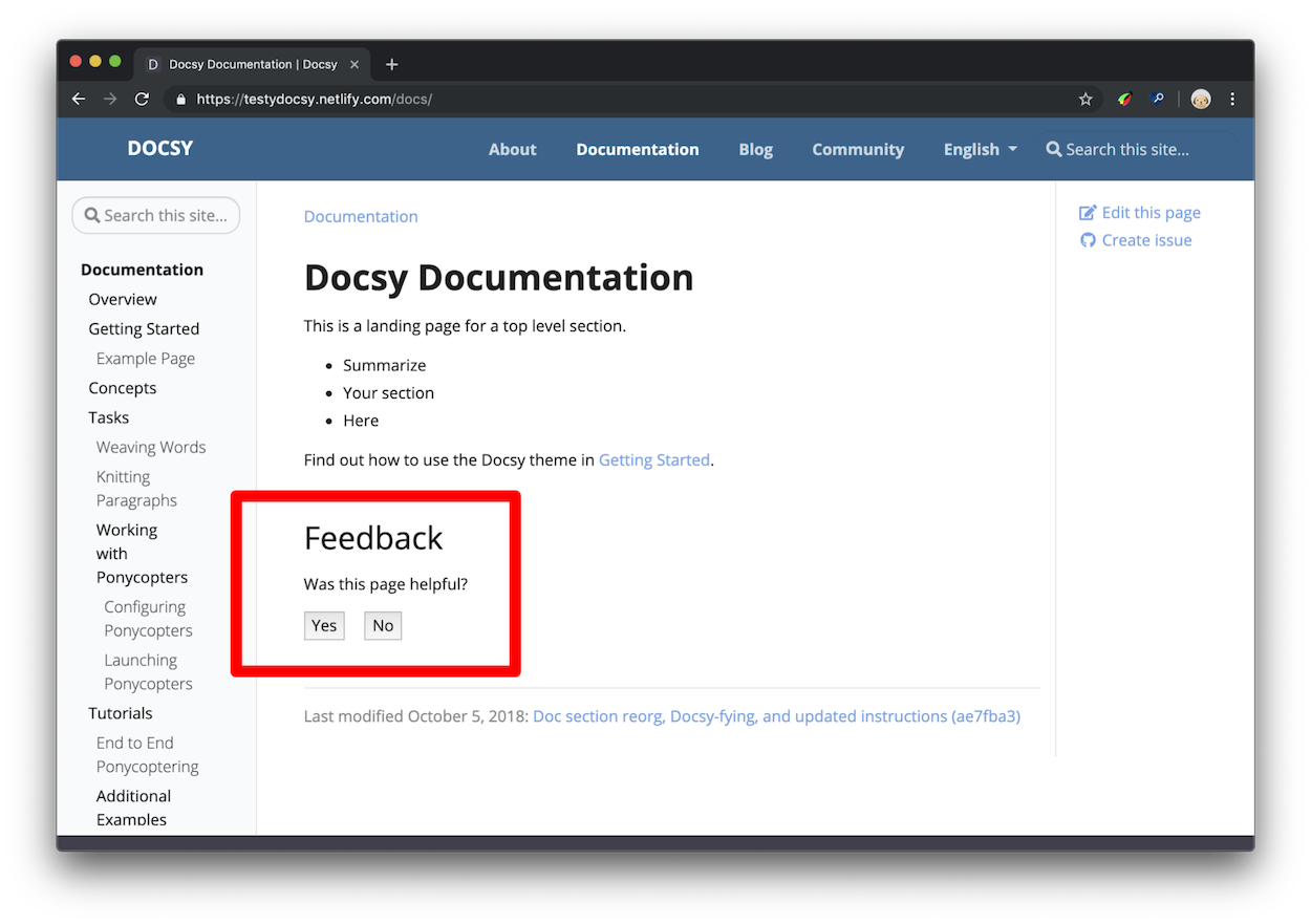
A deliberately long caption demonstrates wrapping on desktop and mobile without covering an adjacent image or widening the document. -
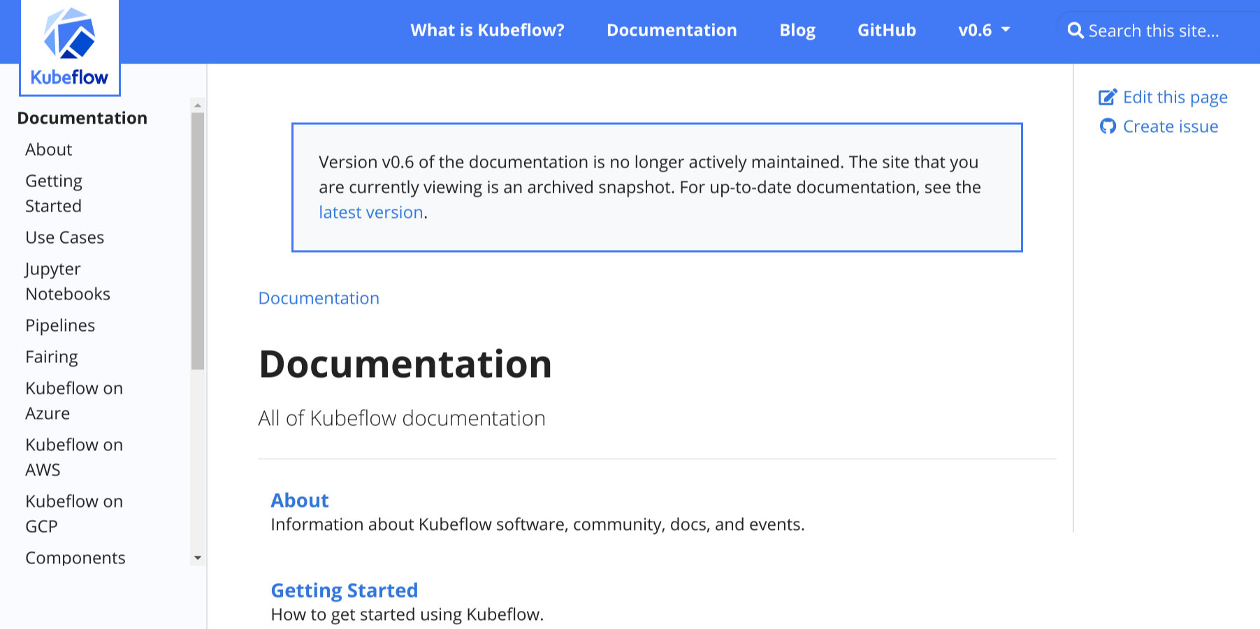
The responsive grid reduces its effective column count on a narrow viewport.
This page enables Image Zoom. Activate any image to inspect it in the shared dialog. With JavaScript disabled, the same three figures remain visible in the same reading order.
Gallery parameters
gallery parameters
columns-
An unquoted value from
1through4; this is the desktop maximum. label-
A nonempty visible label associated with the gallery list.
The container requires at least one direct gallery/image child and accepts no
ordinary body text. Small viewports reduce the effective column count without
changing the requested desktop maximum.
Image parameters
gallery/image parameters
src-
A validated page, global, static, or remote image URL.
alt-
Meaningful nonempty plain text describing the image.
caption-
Nonempty plain text shown below the image.
Gallery records intrinsic width and height for local Hugo resources when available and adds lazy loading. It accepts a remote source URL but never downloads that image during the Hugo build, so remote dimensions remain unknown. Captions do not render Markdown; keep them concise and move rich explanation into nearby prose.
Semantics and fallback
HTML uses a labeled ul of figure, img, and optional figcaption elements.
Each image retains its own alternative text; the gallery label names the
collection. Markdown emits ordinary images followed by italic captions. Print
and RSS render sequential static figures. Gallery has no private JavaScript
runtime: it only marks its images for Image Zoom when that page-level feature is
enabled.
Deliberate limits
Gallery does not crop images to a forced aspect ratio, reorder them by breakpoint, hide overflow, or provide slide navigation. It has no Gallery-specific lightbox. These constraints preserve document order and keep the fallback complete.
11 - Diagrams and formulae
Add local diagrams, mind maps, and scientific formulae to a page.
OINK supports KaTeX, Mermaid, Markmap, PlantUML, and Diagrams.net. KaTeX, Mermaid, and Markmap use build-time or same-origin resources shipped with the theme. PlantUML and the Diagrams.net editor require an explicitly configured service endpoint; they do not silently default to a public service.
LaTeX support with KaTeX
KaTeX renders TeX mathematics for the web. Hugo’s embedded KaTeX support can render formulae at build time, so readers do not need a remote math service.
Inline formulae
Inline formulae use the passthrough delimiter pairs configured in Goldmark. Keep surrounding spaces and punctuation outside the formula when possible.
Formulae in display mode
Use a math code block for a formula on its own line:
MARKDOWN
Activating KaTeX support
math and chem code blocks use theme render hooks automatically. For inline
and delimiter-based formulae, enable Goldmark’s passthrough extension and set
the delimiter pairs appropriate for the site. The included oink.pgsty.com
config shows square-bracket, double-dollar, and parenthesis pairs.
Enable the passthrough extension
The relevant YAML structure is:
YAML
Fill the arrays with Hugo’s documented delimiter pairs. Choose pairs that do not conflict with the site’s prose or code and apply the setting consistently in every build environment.
Add the passthrough render hook
For delimiter-based math, create layouts/_markup/render-passthrough.html in
the site:
GO-HTML-TEMPLATE
The hook can be scoped to a content type or section by placing it under the corresponding layout directory. A scoped hook avoids treating unrelated content as mathematical passthrough.
Chemical equations and physical units
Hugo’s embedded KaTeX supports the mhchem extension. Use chem code blocks
for chemical equations. The same extension supports physical units. See the
mhchem manual for its equation and unit syntax.
Diagrams with Mermaid
Mermaid turns a text definition into a diagram in the browser. Use a
mermaid code block:
MARKDOWN
flowchart LR
  Source --> Hugo --> Static
The theme detects the block, publishes its pinned local Mermaid runtime, and loads it once on that page. Pages without Mermaid do not load the runtime.
Site-wide Mermaid settings live under params.mermaid:
YAML
Per-diagram front matter can override supported Mermaid settings. Keep diagram text readable in source, test both color modes, and provide surrounding prose for information that must remain accessible when a diagram cannot render.
UML diagrams with PlantUML
PlantUML supports sequence, use-case, class, state, and other UML-oriented
diagrams. A plantuml block contains the source:
MARKDOWN
PlantUML requires a renderer endpoint. Enable it only with an approved local or explicit remote service:
YAML
The endpoint receives encoded diagram source from the browser. Review its confidentiality, availability, CSP, and offline implications. For an air-gapped site, use an internal endpoint or commit pre-rendered images; do not point the default configuration at a public demo server.
Mind-map support with Markmap
Markmap converts a Markdown outline into an interactive mind map:
MARKDOWN
# Local-first
## Build
- Hugo Extended
## Browser
- Local scripts
- Local fonts
Enable the feature globally when desired:
YAML
The runtime is pinned and served locally. Keep the underlying outline useful and avoid relying on pointer-only interactions.
Diagrams with Diagrams.net
Diagrams.net (draw.io) can export SVG and PNG files that retain an
embedded copy of their editable diagram. OINK can detect those images and show
an Edit action when an editor endpoint is explicitly configured.
YAML
Export with Include a copy of my diagram enabled. The page can display the exported image offline, but opening the editor requires the configured service. Saving in the editor downloads an updated file to the browser; it does not write directly to the documentation repository.
Treat a public Diagrams.net endpoint as an online integration. If editing must
stay inside an organization, deploy an approved self-hosted editor and set
drawio_server to it.
Resource and authoring checklist
- Use text-based diagrams when reviewable diffs are valuable.
- Provide alt text or adjacent prose for essential meaning.
- Test light, dark, mobile, print, and reduced-motion behavior.
- Keep local runtimes pinned in
VENDOR.jsonand load them only when used. - Never include secrets in diagram source sent to a service endpoint.
- Use pre-rendered output when an online renderer is unacceptable.
- Verify all asset and endpoint URLs under a subpath
baseURL.
12 - Taxonomy support
Organize content with tags, categories, and custom taxonomies.
Oink supports Hugo taxonomies in its docs and blog sections. You can see the default layout and can test the behavior of the generated links on this page.
Terminology
To understand the usage of taxonomies you should understand the following terminology:
-
Taxonomy: a categorization that can be used to classify content - e.g.: Tags, Categories, Projects, People
-
Term: a key within the taxonomy - e.g. within projects: Project A, Project B
-
Value: a piece of content assigned to a term - e.g. a page of your site, that belongs to a specific project
A movie-website sample taxonomy is provided by the Hugo docs.
Parameters
There are various parameters to control the functionality of taxonomies in the
project configuration file. Taxonomies are enabled by default for tags
and categories in Hugo. To disable taxonomies, add the following to your
project config:
Configuration file:
hugo.toml
TOML
hugo.yaml
YAML
hugo.json
JSON
With the default settings, Hugo generates taxonomy pages for tags and
categories. If you want to use other taxonomies you have to define them in
your configuration file. If you want to use beside your own taxonomies also
the default taxonomies tags and categories, you also have to define them
beside your own taxonomies. You need to provide both the plural and singular
labels for each taxonomy.
With the following example you define a additional taxonomy projects beside
the default taxonomies tags and categories:
Configuration file:
hugo.toml
TOML
hugo.yaml
YAML
hugo.json
JSON
You can use the following parameters in your project’s config to control the output of the assigned taxonomy terms for each article resp. page of your docs and blog sections, plus a taxonomy cloud in Oink’s right sidebar:
Configuration file:
hugo.toml
TOML
hugo.yaml
YAML
hugo.json
JSON
The settings above would only show a taxonomy cloud for projects and tags
(with the headings “Our Projects” and “Tag Cloud”) in Oink’s right sidebar and
the assigned terms for the taxonomies tags and categories for each page.
To disable any taxonomy cloud you have to set the Parameter taxonomyCloud = []
resp. if you don’t want to show the assigned terms you have to set
taxonomyPageHeader = [].
By default, the plural label of a taxonomy is used as its cloud title. You can
override the default cloud title with taxonomyCloudTitle. But if you do so,
you have to define a manual title for each enabled taxonomy cloud
(taxonomyCloud and taxonomyCloudTitle must have the same length!).
If you don’t set the parameters taxonomyCloud resp. taxonomyPageHeader the
taxonomy clouds resp. assigned terms for all defined taxonomies will be
generated.
Partials
The partials used by default for displaying taxonomies are defined so that you can easily use them in your own layouts.
taxonomy_terms_article
The partial taxonomy_terms_article shows all assigned terms of a given
taxonomy (partial parameter taxo) of an article respectively page (partial
parameter context, most of the time the current page or context .).
Example usage in layouts/docs/list.html for the header of each page in the
docs section:
GO-HTML-TEMPLATE
This will give you for each in the current page (resp. context) defined taxonomy a list with all assigned terms:
HTML
taxonomy_terms_article_wrapper
The partial taxonomy_terms_article_wrapper is a wrapper for the partial
taxonomy_terms_article with the only parameter context (most of the time the
current page or context .) and checks the taxonomy parameters of your
project’s hugo.toml/hugo.yaml/hugo.json to loop through all listed
taxonomies in the parameter taxonomyPageHeader resp. all defined taxonomies of
your page, if taxonomyPageHeader isn’t set.
taxonomy_terms_cloud
The partial taxonomy_terms_cloud shows all used terms of a given taxonomy
(partial parameter taxo) for your site (partial parameter context, most of
the time the current page or context .) and with the parameter title as
headline.
Example usage in partial taxonomy_terms_clouds for showing all defined
taxonomies and its terms:
GO-HTML-TEMPLATE
This will give you the following HTML markup for the taxonomy categories:
HTML
taxonomy_terms_clouds
The partial taxonomy_terms_clouds is a wrapper for the partial
taxonomy_terms_cloud with the only parameter context (most of the time the
current page or context .) and checks the taxonomy parameters of your
project’s config to loop through all listed taxonomies in the parameter
taxonomyCloud resp. all defined taxonomies of your page, if taxonomyCloud
isn’t set.
Multilingual taxonomy support
For multilingual sites, taxonomy terms get counted and linked within the language site only. Taxonomy config parameters can be adjusted per language.